Heat Map
Objective:
Students will create a heat map of their basketball "makes," learning the concept of converting averages into probabilities, the use of weighted averages, and a simple example of data visualization.
Teacher's Needed Knowledge:
The lesson works best with a teacher who is passionate about sports; but you can always partner with a gym coach or other sports enthusiast. Otherwise only basic math knowledge is required.
Materials:
Clipboards and pencils, worksheets, heat map application.
Procedure:
1. Teacher takes students to a gym and uses the website here to show a completed heatmap. If no projector is available, the heatmap can be printed as a handout.
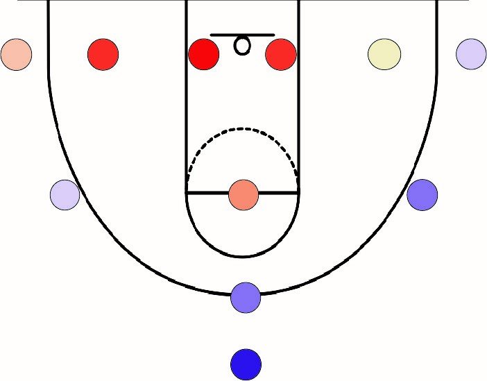
2. Teacher describes the heatmap as a way that basketball players can improve their ability to score. “The heatmap tells you your personal probability of making each shot. Because you get 2 points per shot within the 3 point line, and 3 points per shot beyond it, the value each spot has for you is points times probability, what is called a weighted score. All those numbers are hard to remember, so we use data visualization: Coloring each spot so that higher values look hotter makes it easier to remember your most valuable locations in a game.”
3. After handing out worksheets, students are broken in small groups, one group per hoop. Each group designates one person to take data, one to make shots, and the remaining group members help rebound. They rotate within these three roles until everyone has their score for each position.
Once the sheets are filled out, students enter the values into the application.
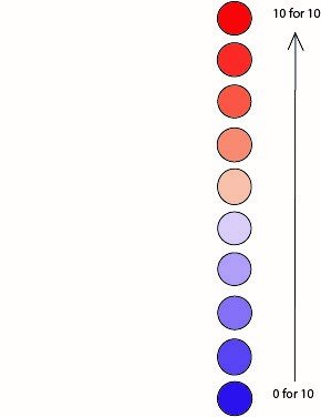
For example, if student A scores 5 out of 5 layups worth 2 points each, and then scores 1 out of 5 shots worth 3 points each, their shot probability is 100% under the basket and 20% outside of the three point line. The resulting weighted averages at these two positions will be 2(1.00) = 2 under the basket and 3(0.20) = 0.6 outside of the three point line. With this information, and supporting heat map data visualization, students will be prompted to determine different weighted scores depending on how many shots they take at each position. Standards: From this exercise, students will be identifying their strengths as an athlete through their own data collection and will be able to determine their weighted statistics at different positions on the court. This hands on approach will empower students to use mathematical analysis to identify their weaknesses and improve their shot make. From an academic standpoint, this exercise will also introduce and provide application for statistical analysis and weighted sums. An example of a generated heat map can be seen in Figure 1 below. In this figure, red correlates to a higher shot percentage and blue correlates to a low shot percentage. As the shooter makes more shots, they are “heating up.”
Launch the Heatmap Web App